
beige color meaning
For too long, beige has suffered from a reputation as the “boring” color—the default choice for office cubicles and rental apartment walls. But look closer. Beneath the surface of this unassuming neutral lies a rich history and a profound psychological impact. Understanding the true beige color meaning is essential for anyone seeking stability, warmth, and timeless elegance in their life, design, or brand identity.

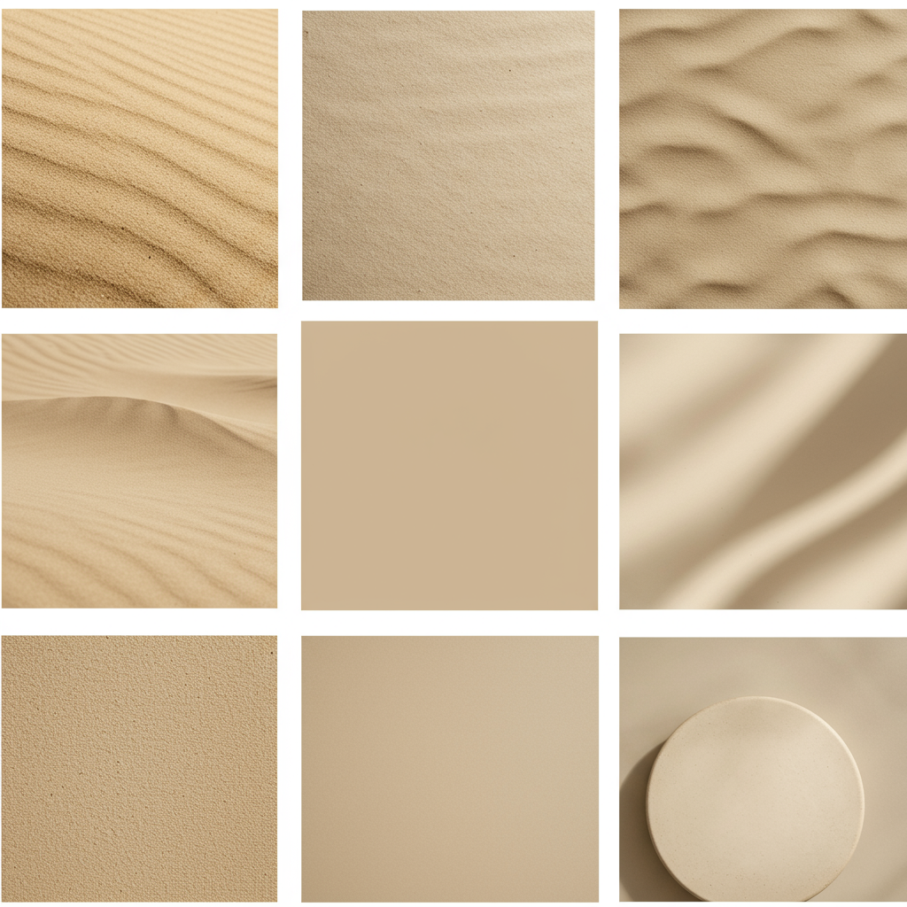
Beige is not merely a washed-out color; it is a complex blend of brown (representing stability and earthiness) and white (representing purity and simplicity). This unique combination results in a sophisticated neutral that acts as the ultimate balancing force.
The Core Psychology of Beige
Psychologically, beige operates as a powerful grounding agent. While white can feel too sterile and brown can feel too heavy, beige strikes a perfect equilibrium. It embodies reliability and constancy, offering a sense of calm reassurance that few other colors can match.
Choosing beige often signifies a preference for quality over flash, and timelessness over fleeting trends. It’s the color of classic trench coats, natural linens, and ancient stone architecture—things built to last.
Positive Meanings: Stability and Comfort
The positive associations with beige are rooted in its connection to natural materials and a grounded existence.
- Reliability and Trust: Beige rarely seeks attention but provides a dependable foundation. It suggests an approach that is steady, trustworthy, and traditional.
- Comfort and Warmth: Because it contains warm brown undertones, beige immediately feels inviting and comfortable. It evokes the feeling of cozy materials like wool, sand, or natural cotton, promoting a sense of hygge (coziness and well-being).
- Timeless Sophistication: Unlike highly saturated colors that can quickly become dated, beige possesses an inherent, classic elegance. It suggests quiet luxury and understated refinement.
Negative Meanings: Blandness and Uniformity
Every color has a shadow side, and for beige, its neutrality can sometimes be perceived negatively.
In the late 20th century, particularly during the era of mass-produced office equipment, beige became synonymous with uniformity and a lack of imagination. This led to terms like the “beige era,” where life was perceived as functional but dull.
If used without texture or varied accents, beige can sometimes be interpreted as unadventurous or lackluster. It requires thoughtful pairing to ensure it reads as elegant and not merely boring.
Decoding the beige color meaning in Design
In the realm of interior design, fashion, and branding, beige is one of the most hardworking colors in the palette. Its ability to recede while still providing warmth makes it an indispensable tool for designers.
Beige in Home Decor and Interior Design
Beige is the quintessential interior neutral because it provides a foundation that is warm, unlike the coldness sometimes associated with pure white or gray.
In contemporary interiors, beige has made a massive comeback, often replacing cooler grays to achieve a warmer, more minimalist aesthetic. It is often used to make small spaces feel larger and open-concept homes feel more connected.
The key to successful beige decor is texture. Using varied materials like linen, jute, bleached wood, boucle, and rattan ensures that the color remains visually interesting and luxurious, rather than flat. A perfectly chosen beige wall provides the ideal neutral backdrop for art and statement furniture.
Beige in Fashion and Apparel
In fashion, beige is synonymous with sophistication and utility. Think of iconic pieces like the Burberry trench coat or classic tailored suits.
Beige apparel suggests quiet authority and high quality. It serves as a fantastic base layer that allows richer colors to truly pop. Wearing beige suggests a sense of composure and an appreciation for foundational, enduring style rather than chasing fast trends.

It is particularly popular in summer and resort wear, where its natural association with sand and light linen makes it feel airy and cool.
The Nuance: Identifying the Undertones
Beige is rarely just “beige.” Its psychological impact shifts dramatically based on its undertones—the subtle hints of other colors mixed into the base. Understanding these undertones is critical for using the color effectively.
| Undertone | Description | Psychological Effect | Ideal Use |
| :— | :— | :— | :— |
| Yellow/Gold Beige | Often leaning toward cream or straw. Highly warm and sunny. | Cheerful, traditional, cozy. | Traditional interiors, spaces needing lots of warmth. |
| Pink/Red Beige | Closest to flesh tones or plaster. Very soft and inviting. | Calming, nurturing, human. | Bedrooms, high-end fashion, beauty branding. |
| Green/Gray Beige | Often called Greige (a mix of gray and beige) or Taupe. Cooler and more refined. | Modern, balanced, versatile. | Contemporary architecture, industrial design, universal neutrals. |
The Historical and Cultural Context of Beige
While the term “beige” originates from the French word for un-dyed wool, its historical popularity often reflects economic stability and shifting tastes toward naturalism.
In the 18th and 19th centuries, natural and undyed fabrics were common, giving beige strong ties to natural fibers and sustainability. Its use in military uniforms (like khakis, a form of beige/tan) throughout the 20th century also cemented its status as reliable and practical.
Today, the return of beige in design is a reaction against the overwhelming saturation of technology and digital life. People are craving colors that feel authentic, calming, and rooted in nature—a perfect antidote to digital overload.
Tips for Using Beige Effectively
If you want to harness the stability and elegance of beige without falling into the trap of blandness, follow these expert tips:
- Prioritize Texture: Never use smooth, flat beige paint on every surface. Incorporate woven textiles, nubby wool rugs, and textured wall coverings to give the color depth and interest.
- Contrast is Key: Beige works beautifully when contrasted with black, navy, or deep charcoal gray. This high contrast ensures the beige reads as sophisticated and intentional, not accidental.
- Use Metallics: Gold and brass accents are perfect companions for warm beige tones, instantly elevating the space and adding a touch of glamour without overpowering the calm aesthetic. Silver and matte black work best with cooler, greige tones.
- Layer the Neutrals: Don’t limit yourself to just one shade. Layer varying tones of beige, cream, sand, and taupe in the same space. This monochromatic layering technique adds richness and complexity.
Conclusion
The beige color meaning transcends its reputation as merely “basic.” It is the color of quiet confidence, reliable stability, and enduring elegance. When approached with intention, beige provides a grounding warmth essential for creating balanced, sophisticated, and utterly timeless environments. It’s not the absence of color; it is the presence of perfect harmony.
—
Frequently Asked Questions (FAQ)
Q1: Is beige considered a warm or cool color?
Beige is generally considered a warm neutral because it contains undertones of brown and often yellow or red. However, shades that lean heavily towards gray (often called “greige” or taupe) can be perceived as slightly cooler, offering versatility depending on the specific application.
Q2: What is the difference between beige, cream, and taupe?
- Beige: A light tan color, essentially pale brown. It is grounded and often linked to natural fibers and sand.
- Cream: A softer shade of off-white with distinct yellow undertones, making it slightly richer and warmer than beige.
- Taupe: A sophisticated color defined by its inclusion of gray. Taupe is fundamentally a mix of gray and brown, often resulting in a cooler, more contemporary neutral than traditional beige.
Q3: What colors pair best with beige?
Beige is incredibly versatile. It pairs exceptionally well with rich jewel tones (emerald green, sapphire blue), deep earthy colors (terracotta, olive green), and high-contrast neutrals (black and crisp white). For a soft, elegant look, try pairing different shades of beige with blush pink or light peach.